Gateway to the World of Data: Flocktory's omnichannel platform underwent rebranding
The Flocktory platform has completely changed its corporate identity, from its logo to its website, in collaboration with the Catzwolf agency. During its 10 years of existence, the business processes and philosophy of the company have changed. The service team told Sostav how they succeeded in showing that real people were behind big data, and what metaphors were embedded in their new positioning.
Beginning
Flocktory is an omnichannel marketing automation and personalisation platform, offering performance and CRM solutions for retail, brands, financial institutions and other business categories. We help to attract customers, increase sales, raise profits, and grow loyalty. We open up new monetisation opportunities and solve business problems.
When the company was founded, everything moved so quickly that the logo and name were developed literally within a few days. At that time, they fully reflected the business idea.
- Name
In English, the word Flock means “to gather”, and also refers to a group that moves together in the same direction. That’s the kind of group we felt like. At the same time, our system allows our partners to create their own groups, and we took “-tory” from the English word “factory”.
All our activities are focused on building a base of loyal customers for our partners, and that’s why we are Flocktory.
- Logo
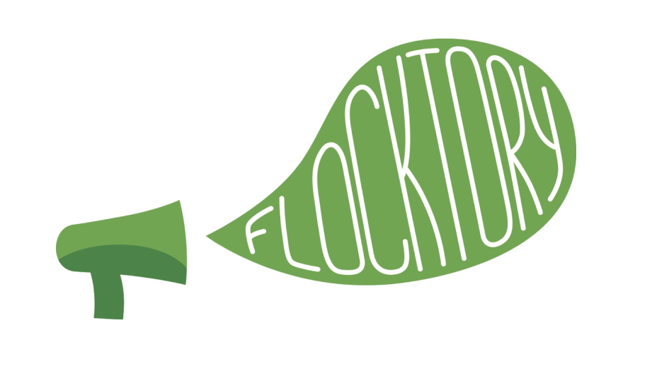
Following the name, our logo came into being. It reflects sustainability in every sense, as well as growth, health, support, trust, partnership, balance and stability, all in a green colour scheme.
The business started with referral marketing, so the megaphone and bubble gum perfectly reflected the idea. The elements seem to say: “We have all the resources and tools you need to make your communication heard, and to attract the right attention.” Moreover, a megaphone is usually found in the hands of a leader who is willing to share wisdom and take the lead.
Now
As time went on, we became a fast-growing technology startup with huge potential. Within a short period we expanded the range of our products from a referral program to complex solutions for personalisation, marketing automation, working with first-party data, expanding the capabilities of the Performance solution, and CRM tasks. And we don’t plan to stop there.
Following the development of our business, its external renewal naturally had to take place to maintain consistency of perceptions, and correspond to the spirit of the times. Plus, our vision of the company had already existed outside the idea of a megaphone for quite some time. The issue of rebranding has been brewing for several years, and despite the fact that this wasn’t the easiest moment, we decided to resolve this issue right now.
The rebranding of an IT company in the B2B segment cannot be transformed into art without losing its meaning. That’s what I was once told at a well-known branding agency. I would argue against this idea; if you’re deeply involved in a business, you have to activate your imagination, and understand that everything is possible.
Yulia Isyuk, Flocktory Marketing Director
The path
Initially, we had two paths.
- The first one was simple: to focus on the typography and work with the word itself, because we didn’t want to change the name. This was the core that had been laid down by the founders, and which had become part of the company’s DNA.
- The second one was more difficult: to create a new brand image based on a creative concept and visualization that would make it possible to create not just branding, but an art project with the right meaning. This would help us to distance ourselves from other players due to the creative and aesthetic components.
We could not have known when or how to set out on the second path if it were not for our main art addict, CMO Yulia Isyuk. Yulia, together with the team, rethought the business in its new configuration, and they were able to see and, more importantly, show what we were as a team, a product, and a company, and how much meaning, beauty, and aesthetics were contained within this.
Yulia Pasechnikova, Flocktory CEO
Meaning
Branding is based on a concept. Our products were developing, the team was growing, getting bigger and changing; this led to the emergence of new meanings for our business.
For ourselves, we have combined them into three large ‘blocks’: relevance, sustainability, and efficiency.
Techniques
We supplemented the blocks with visual techniques, and developed a conceptual duo to achieve visual and semantic integrity.
Multilayeredness. Flocktory consists of many layers — products, processes, people, services, results and so on.
Metamorphism. Flocktory is all about movement and change. We don’t stand still; we move forward every day and optimise campaigns for partners: we conduct A/B and MVT tests, and introduce new solutions.
Transparency.Our business is transparent in everything: reporting, working with data (in strict compliance with Federal Law 152), processes, results, costs, relationships within departments and the company and so on, because there can be no strong relationships without honesty and trust.
States
The next step was to determine the states of the chosen meanings and techniques. For us, that meant both a dynamic and a static state.
On the one hand, we occupy a strong position in the market; we stand firmly on our feet, our products demonstrate steady results, and our team are experts in what they do. On the other hand, we are constantly on the move, creating new things, testing improvements, and optimising our approach, because without development, a company stagnates; it then ceases to be relevant and needed.
A unifying element
But what unites these meanings, techniques and states, what turns them into Flocktory? The core of the company, its main value and what makes us Flocktory are our people. Our team, partners, and users.
A new reading
Having gone from meanings to a unifying element, we had to ask ourselves: who we really were, not in terms of positioning, but in terms of essence.
We concluded that the essence of Flocktory was its ability to see the real people behind contracts, processes, monitors, zeros and data units. Flocktory is an infinite number of users and portraits, the approach to which we create from data every day.
It was this idea that became the basis of the rebranding, and provided the inspiration for a strong main element that fully reflected the essence of the business — a user portrait created from data.
The key visual element
To implement the idea, we needed to understand what kind of data could be used to make a portrait, and we also had to decide how to show that it was not static, but was instead constantly being supplemented and updated; in other words, it was generative.
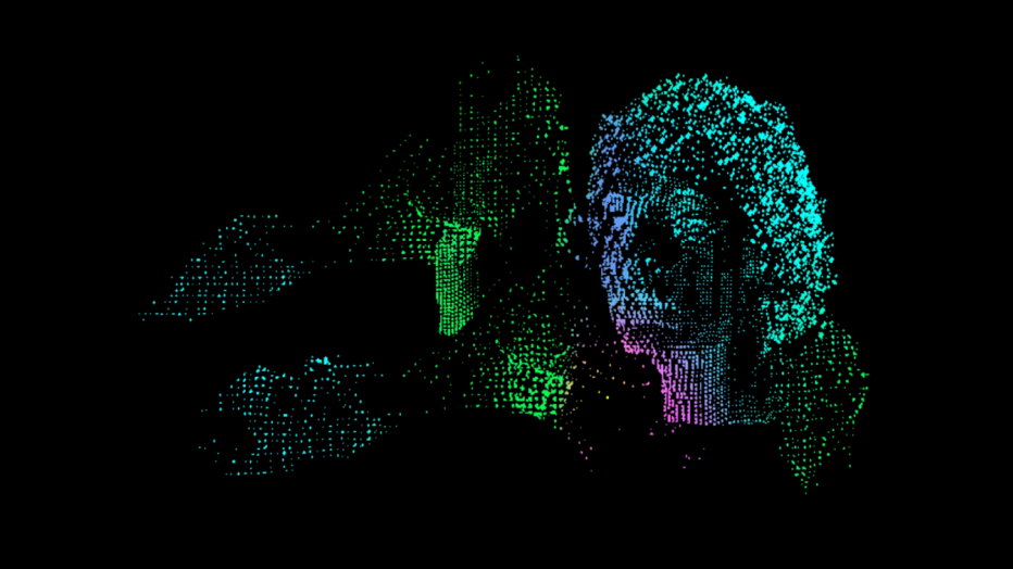
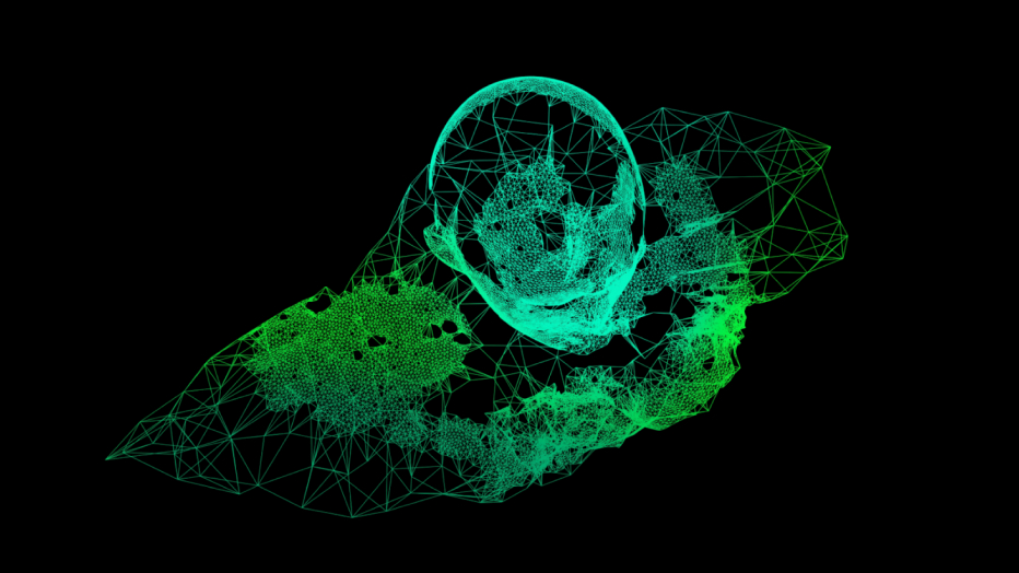
Let’s start with the data as the basis of the portrait. This is represented in its most basic form, as 0 and 1 — a binary code and a pixel, the smallest indivisible element. But today, data also exists in more complex forms and mathematical models. We live in a world of neural networks and AI, which our company also uses in its work.
We concluded that there should be several portraits. This would make it possible to draw attention once again to the huge number of very different users we have, and show the evolution of data organisation forms from the simplest to the most complex — today’s data.
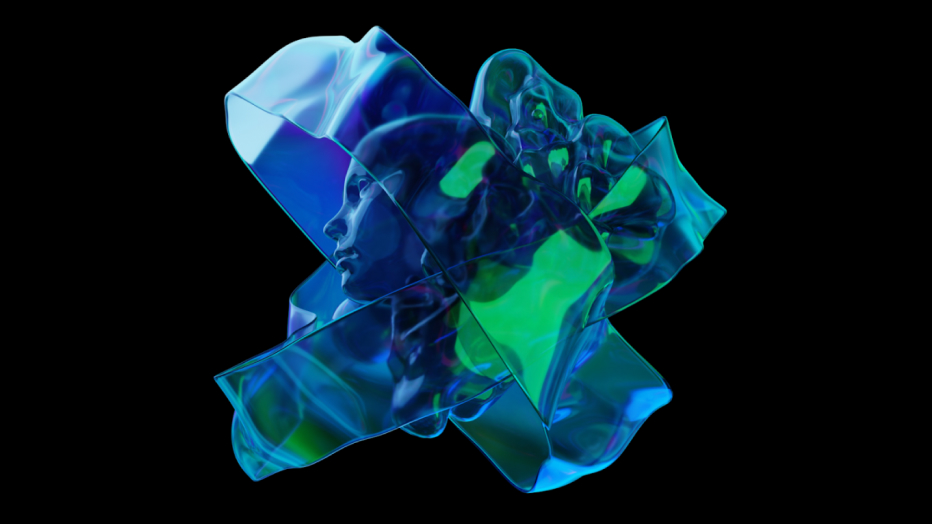
A new logo
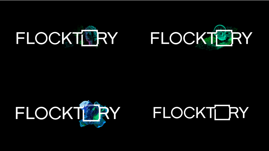
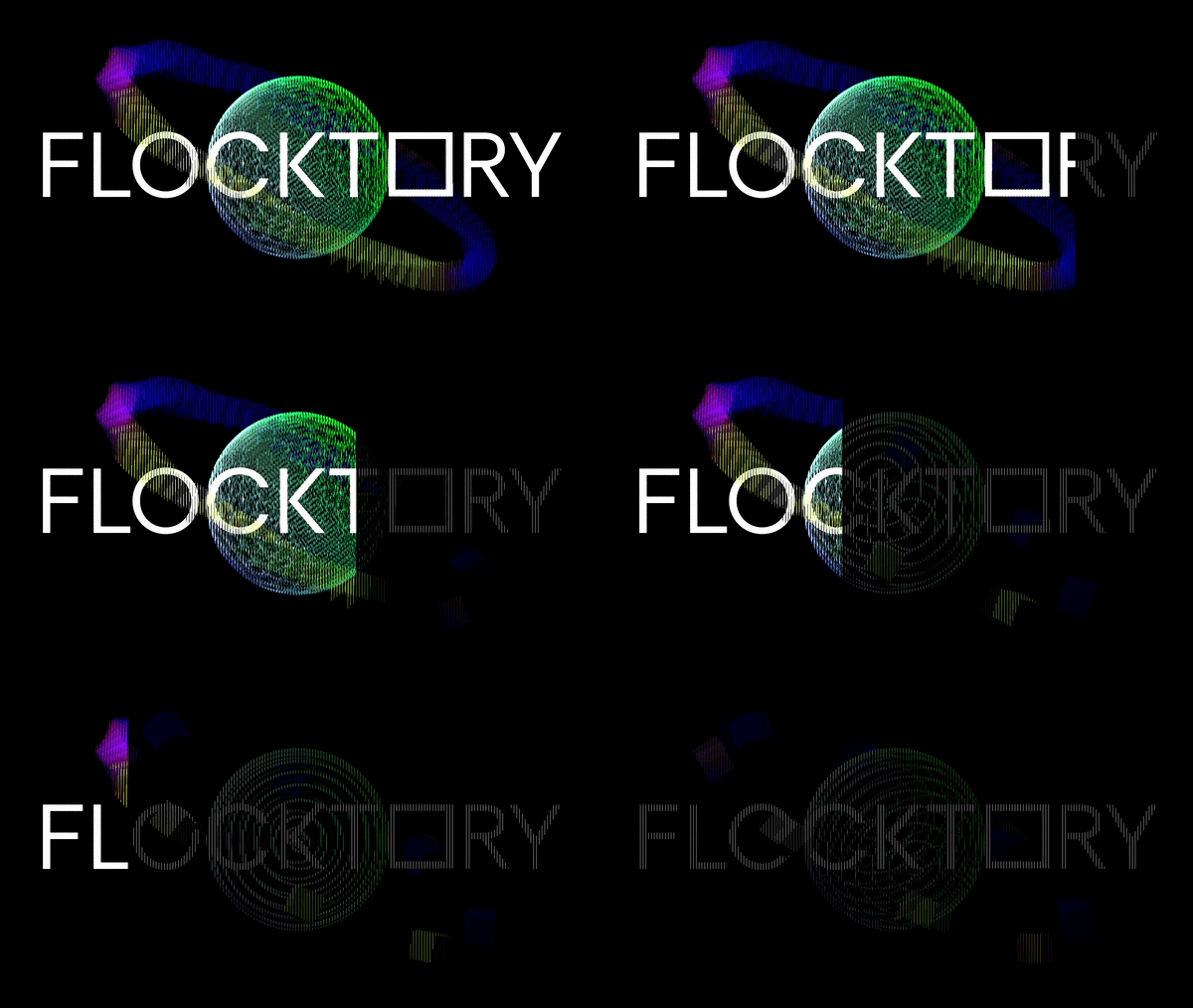
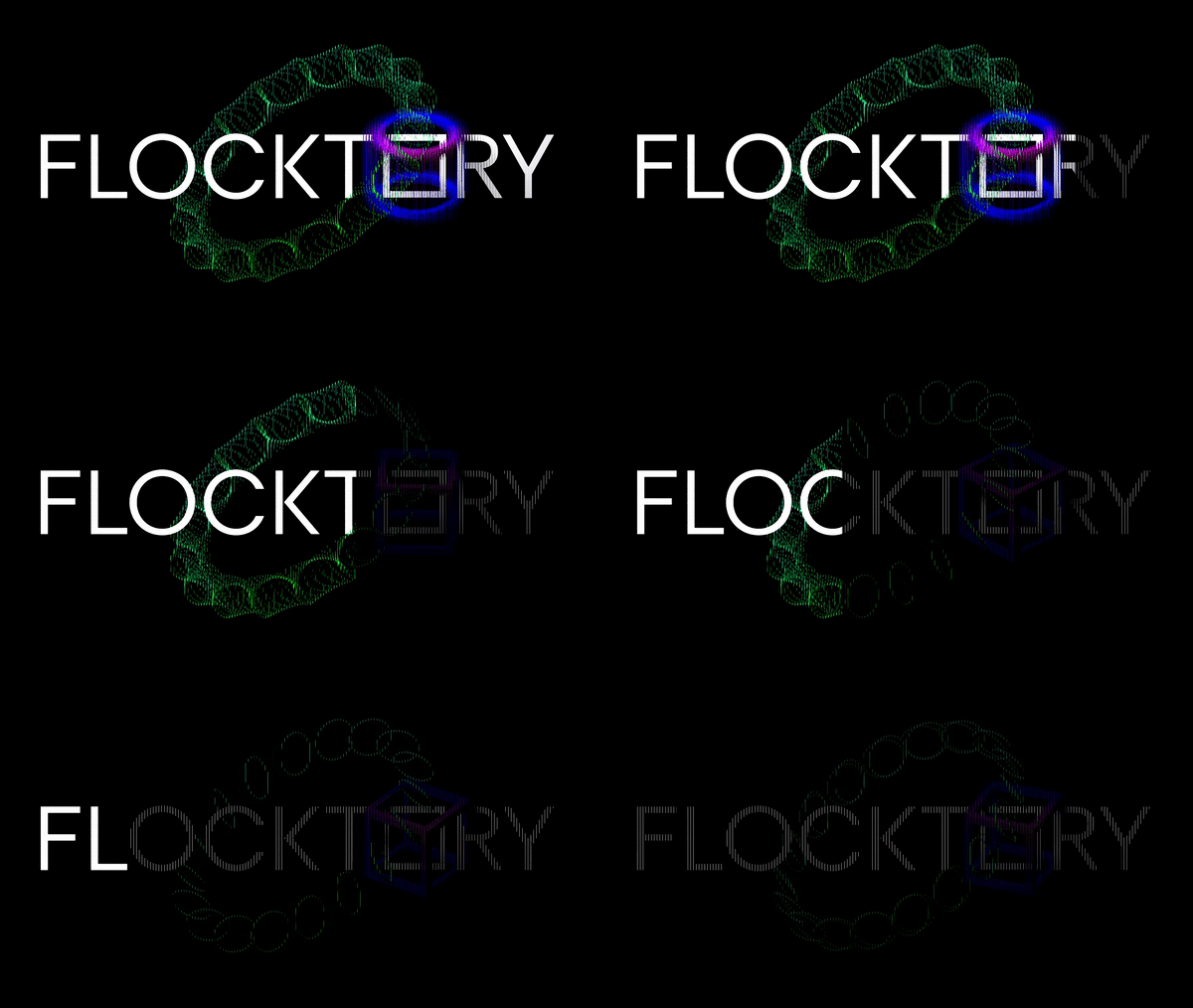
The portrait exists in a frame, because the data is always contained within the model or parameters. For us, the conditional frame was the name in a new style and with a new message. We depicted the dynamic element as a circle, and the static one as a square. These elements were integrated into the two O’s of the company’s name.
The first “O” represented development, and the second literally became a frame, a portal to the world of data, technology and the Flocktory service.
The result we have achieved really reflects the essence of the company, corresponds to the spirit of the times and, something which is very important for us, the whole team likes its stylish, concise implementation. We managed to instil the right message in the logo, and at the same time we allowed ourselves to make several different equal versions under one semantic umbrella. Now we look exactly the way we feel.
Yulia Pasechnikova, Flocktory CEO
A little history
Let us show you how we moved from a megaphone to our new concept with portraits created from data.
Website
In our B2B segment, the main channel for attraction is direct sales, so the website is most often of secondary importance. But when a company grows, so does the number of partners, products and solutions it develops.
A website that is no longer relevant in many ways can interfere in certain situations. Potential partners expect to see clearly stated opportunities and the solutions offered by the company. They associate the design and content with the competence of our team, so it was simply impossible to postpone these changes.
The new Flocktory website deserves its own story, at least for us. But in short:
- We wanted each visitor to receive aesthetic pleasure from the process of getting acquainted with the information they needed, a kind of mix of rational content and emotional presentation.
- The new ‘near-space’ theme reflects the planetary scale of the business and its limitless possibilities. Sure, it’s immodest, but who’s going to stop us?
- Futuristic objects represent our creative and individual approach to solving the problems faced by our partners.
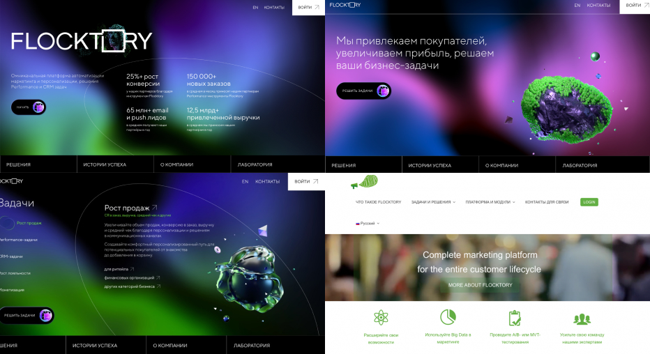
Right now you can see the first release, and in early autumn, new sections and a new reading of our solutions will appear on the website.
